Thursday, December 16, 2010

Good to be back!


I don't know if it happens to other artists but sometimes I go through periods where I think a lot about painting but just can't get myself to sit down and put brush to canvas. Of course, there have been ample excuses to explain my long absence: a house move in the summer. extraordinary work events (nothing bad!), overseas travel - need I say more?

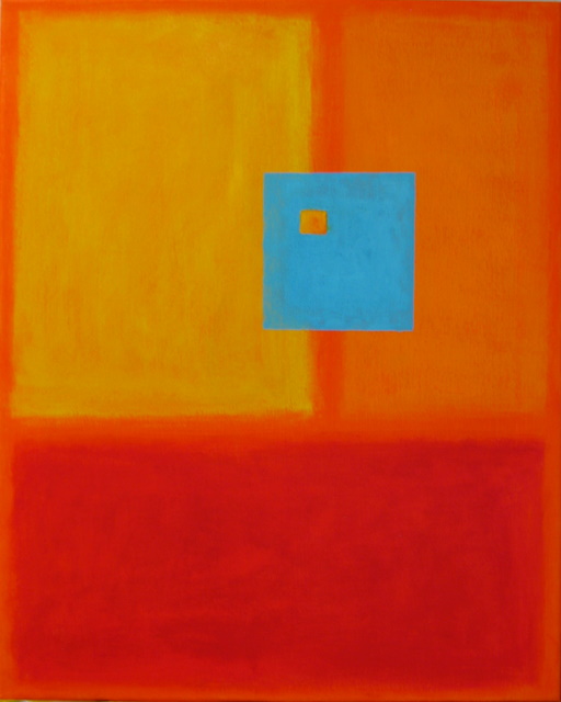
As I have done in the last year or so, after every break from painting I restart with a big enough abstract to provide room for unfettered brushwork. Dreamworld is a culmination of the various techniques I have been using for my abstract work.


The canvas was prepped with a heavy coat of gesso. Nothing beats laying on thick creamy gesso with a large knife and pushing it around the canvas! Once this was dry I gave it a light sanding to knock down the highest areas then began to layer on primarily reds and blues with various sized brushes. The finished piece still shows that direction of brush strokes was either vertical or sideways because I wanted to reinforce the square shape of the canvas.


Layers of red and blue glazes were laid on until I had the basic structure of the painting. I then used iridescent copper paint to add highlights that were left untouched in some places and scrubbed hard into the canvas in other places. The corners of the canvas were darkened with mixtures of browns and blacks made from primary colors. This helped to define the focal point of the painting.


Dreamworld, Acrylic on canvas, 36"x36", NFS

Wednesday, June 30, 2010

Illusions

In viewing a landscape, real or represented by a painting or photograph, one "reads" the elements by examining landmarks and categorical references (sky, land, water, etc) to form sense of what is being conveyed. When a reference parameter is changed or typical landscape features minimized, it can appear as if the landscape could represent any number of possible scenes.


Adrift has a razor sharp and straight horizon line suggesting that one might be looking at a seascape. Yet the foreground has a curious mix of yellows, greens and darks that could be endless fields or greenish-blue ocean waves! No other reference exists in the picture to guide one's interpretation thus allowing imagination to take over. The scene can be whatever the viewer wants it to be.


Adrift, Acrylic on canvas board, 16"x20, NFS

Sunday, June 27, 2010

Glimpses of the Sublime

Those of us blessed with normal vision are bombarded with images every waking moment. But a scant few of these actually make a memorable impression. I imagine the images that are meaningful enough to be recalled are unique for each of us even if we see the same common scenes.


Afloat is inspired by the endless bands of color that can be seen from an airplane window at sunrise and sunset. Because of the high perspective there is often no clear anchor point with which to orient oneself. Some color displays (such as when flying the polar route from the US to the far east during the summer) can be so spectacular and prolonged as to remain in memory forever.


PS: The slight glare on the surface is simply my error in taking the photo after applying the acrylic sealer.


Afloat, Acrylic on canvas, 18"x24", $100

Saturday, June 12, 2010

Bold Strokes

Sometimes wielding the brush with high energy is the only way to come out of a slump. Covering the canvas with a sense of urgency helps me to get past the barrier of inertia after a period of not painting.


Modernity is done with a large brush and knife. The dominant color is black which I don't use a lot but in this case it just seemed right.


Modernity, Acrylic on canvas, 16"x20", $100

Monday, May 31, 2010

Blue Green Yellow

I've always been intrigued by Monet's series of the pond at Giverny. The complexity of the composition and depth of color suggest that rendering the same scene repeatedly did not keep Monet from having a fresh perspective each time.


Reflections is an abstract that started out without any objective image in mind. As I laid the layers of color, the image that began to emerge reminded me of Monet's combination of blues, greens and yellows to achieve a harmonious picture. The canvas for this piece was toned with red gesso to provide warmth to the scene.


Reflections, acrylic on canvas, 16"x20", $150.00

Wednesday, May 12, 2010

Rothko Explored

While the Rothko style of color field painting appears simple on the surface, I am finding that achieving the depth of color so typical of his work is difficult to achieve. As opposed to the spontaneity and energy of expressionistic painting, color field work requires infinite patience (or perhaps greater skill than mine?) as layers of color are added to create a perception of depth that is reminiscent of tonal painting.


Imagination, Acrylic on canvas, 16"x20", $100

Sunday, April 25, 2010

Sanibel Dream

Sunsets have been a favorite subject in my paintings ever since I first picked up a brush. And there are few places in the world with sunsets as spectacular as on Sanibel island in Florida. This piece offers a play on Rothko's color field technique to describe the essence of a sunset.

Sanibel Dream, acrylic on canvas, 16"x20", $150.00

Tuesday, April 20, 2010

Joyous Sport


This playful piece is inspired by the kite festival that takes place in many parts of India during January. Most of the country has crisp cool and clear blue-sky days which makes it a particular joy to watch hundreds of colorful kites.

Indian kites are made of sticks and paper which makes then especially light and capable of great speed when aloft. This is probably what explains the skill with which flyers compete with each other. The objective of the contest is to cut another kite free using precise control to slice across the competitor's string! During the kite festival cut-off kites can be seen floating all over the sky.

Jamghat, Acrylic on canvas, 18"x24, $100

Saturday, April 10, 2010

Next Stop

On the way back from Shanghai, I spent a few days in India as I do about every six months or so. Part nostalgia, part dread, and the rest of it anticipation, the trip is never dull. India is especially tough on travelers. Vestiges of old-fashioned bureaucracy and a plethora of ad hoc methods for running a massive country leave even the locals befuddled. Only those who get past this toughness get to savor the grace and charm of an ancient culture striving to integrate the most modern of influences.


I am always struck afresh by, and this is the inspiration for this posting, the progressive degradation of the environment that keeps moving apace and is more noticeable to me on each visit. Ruined Earth was done using the same technique as in several previous pieces (which I am calling the Meditation Series). Layers of thick and thin paint led to the final effect which aims to represent a tarnished sheen through which rays of brightness break through. Even these appear to be but dying embers waiting to be finally extinguished.


Ruined Earth, Acrylic on canvas, 16"x20", $150

Saturday, March 20, 2010

Shanghai Skyline

Shanghai happened to be on my travel itinerary and I was fortunate to be able to steal an afternoon off to see the city. Most of the modern sections, which are on the side east of the Nangpu river that is called Pudong, have been built during the past 15 years and include an impressive skyline studded with skyscrapers to rival any world city.

I used just an ordinary pen to sketch an interpretation of the Shanghai Pudong skyline. The building just to the right of center that looks like a bottle opener is the World Financial Center and one of the most unique buildings ever -- though Shanghai boasts quite a few.

Shanghai Cityscape, Pen on paper, 11"x12", NFS

Friday, March 12, 2010

Taking a break

Just so the blog followers know, I will be traveling for the next several weeks so it is possible I will not be able to post to the blog for a while. It does not mean I have disappeared, but just that there will be a temporary gap as I circle the globe for a living.

So long.

Wednesday, March 10, 2010

Doodling or sketching?

Since I began sketching again a while back, I have found that thinking about art has become more and more of a constant occupation! On days when I have to spend long hours on teleconferences or have to wait between flights while on business travel, I can experiment with all kinds of images whether from my imagination or drawn from the surroundings. All that is needed, as in the current post, is a pen or pencil and a scrap of paper no matter how big or small.


Perhaps it is just my imagination, but sketching while my mind is focused on something else (such as a long phone call) seems to free up the hand and allows much looser strokes. It is also pretty efficient use of time and perfectly in the zeitgeist of our times where multi-tasking is a badge of pride.........


Untitled, Pencil on scrap office paper, NFS

Thursday, February 25, 2010

Hot Earth, Cool Sky


Desert Dusk continues the series begun with Endless Prairie and Ocean Sunrise. The technique is now a bit more refined. Essentially a first thin layer of random warm and cool colors provides the background. Layers of color are applied with a knife to establish the horizon line and build up texture and depth of color. Once the big areas are established and approximately the right hue, thin glazes are applied to achieve the shimmering multi-hued effect. Unfortunately the photograph mutes the color and has a bit of reflection on the bottom right.

Desert Dusk, Acrylic on stretched canvas, 16"x20", $150 Buy Now

Tuesday, February 23, 2010

Abstract Dawn


Ocean Sunrise continues the series I started in the previous post (Endless Prairie). The technique is similar and uses multiple layers of paint to achieve the ultimate effect. Paint is applied with various sized knives except for a couple of thin glazes for which a brush was used. The ultimate idea was to achieve the impression of a lightening dawn sky and a vast ocean with multiple bluish green hues.

Ocean Sunrise, Acrylic on stretched canvas, 16"x20", $150 Buy Now

Sunday, February 21, 2010

Another Abstract Landscape

Reducing composition of a landscape to the bare essentials (e.g. earth and sky devoid of detail) allows for other elements to be explored more fully. The latter can even be exaggerated to make a point.


Endless Prairie is a simple, almost geometric, composition in which the complex color scheme of a landscape is demonstrated. The canvas ground was prepared with random blocks of thickly applied blues, oranges and grays in the sky area, and reds, blues, yellow, burnt sienna and black for the foreground land mass. Once this was dry, the skyline was marked with masking tape followed by a layer of titanium white mixed with tinges of ultramarine blue and the least bit of cadmium red applied with a knife. The acrylic was mixed with a dab of thickening gel to keep it from going on in a solid layer.


The tape was removed, the sky allowed to dry and the foreground was completed similarly -- a yellow, green and red mixed to give an earthy tone mixed with thickening gel and then dragged on in a mix of vertical and horizontal strokes. As this was drying, I scraped in a few places to reveal the brighter color underneath. After everything was dry, I applied a watery glaze of dioxazine violet to the sky and pthalocyanine green to the foreground. This helped to  unify the painting.


Endless Prairie, Acrylic on stretched canvas, 16"x20", $150 Buy Now

Thursday, February 18, 2010

Textural Beauty

Part of the appeal of abstract art for me is the beautiful textures that artists can create either by using thickly applied paint or modeling paste. I have done some work with knives and thick tube paint and have been pleasantly surprised by the complex feel that results.


Complexity is a first attempt at using modeling paste to create a textured background on stretched canvas. I then followed up with successive layers of paint using stiff bristle brushes and knives. The initial layers were the darkest hues (pthalocyanine blue, violet, alizarin crimson, burnt sienna) followed by the light (cadmium orange, Hansa yellow light, light blue). The brightest highlights were iridescent copper paint applied with a knife dragged lightly over the surface. It took 5-6 applications to get the right contrast between the dark background and the reflective lights.


Complexity, Acrylic on stretched canvas, 16"x20", $100

Saturday, February 13, 2010

Abstract or Impressionistic?

This piece started with no notion of the end result. Recently I have been studying some of the works of Mark Rothko whose mastery of color was exemplary. Though many of Rothko's works appear to be solid blocks of color, this is hardly the case. On closer study, it is possible to detect the complex mixes of hues and tones layered together to create stunning effects.


Rainforest started with thin layers of yellow, orange and sienna, laid on quickly with a 2 inch brush. All subsequent work was done with a knife even before the background colors had completely dried. This allowed me to push and pull the paint so that it went on in broken strokes as it dragged over the tacky background. The forest-like image began to appear rather quickly and from there on I mixed some thickening gel with the final layers to give more texture to the paint.


As always I wondered if I had stopped too soon. But I think I will leave this one alone.


Rainforest, Acrylic on stretched canvas, 16"x20", $100

Sunday, January 24, 2010

Tonalism or Impressionism? Or Both?


The past few weeks I have mainly been posting abstracts though, as the regular readers know, I am most interested in where I began my painting journey - landscapes. So even while making a number of abstracts, I have kept doing landscape work which I expect to post during the next few weeks.


Winding River tries to synthesize the use of varying tones to create depth and form in the picture with impressionist brushwork that is high-energy and very visible. Blending is kept to a minimum and despite layers of color being applied the background colors, including bits of the white canvas, can still show through.


Winding River, Acrylic on canvas board, 11"x14", $75

Saturday, January 23, 2010

Geometric Abstract


The use of geometric shapes in art can probably be traced back to ancient cultures even though its adoption as a modern art form is more recent. Two-dimensional shapes defined by color, texture and location on the canvas can provide an interesting way to describe our world.


Urban Panes is a composite of the myriad colors and shapes of windows that can be found in a city environment.   The appearance of these windows can change in infinite ways through different times of day, by season and in changing weather conditions. For this piece I worked against a black background and layered paint mixed with small amounts of texturing gel.


Urban Panes, Acrylic on stretched canvas, 16"x20", $75

Wednesday, January 20, 2010

Organic Abstracts


Even the most unformed abstract paintings seem to have inspiration in some shape or form. I am finding that my past experience of close-up photography of flowers and later doing close-up flower paintings is leading me into abstracts that reflect organic shapes like ones that might be found in nature.


Molten is part of my ongoing exploration of abstracting organic shapes drawn with primary colors and simple highlights to draw and hold the eye. The paint is laid on in a couple of layers using both a brush and various sized knives. I can almost see a flower pushing to break free of the canvas..........


Molten, Acrylic on stretched canvas, 18"x24", $100 (unframed)

Wednesday, January 13, 2010

Happy New Year


I want to wish all of you a very happy new year and to thank you for your interest in my blog during 2009. Your support of my blog, whether through your supportive comments or by your repeated visits, has provided me much appreciated encouragement. Every time I have been gone from the blog for an extended period, I have felt compelled to come back and keep providing new posts for your pleasure.


Lately I have been delving more and more into abstract compositions. This has made me wonder how much looser my style could get with a bigger canvas. While I have always wanted to work in big broad strokes working with large canvases has seemed highly challenging .


The hardest part was working with an unstretched piece of canvas and not having a convenient workspace to place it on. I had to put it on the floor and then try to keep it from moving while I troweled the paint on it. Next most difficult was moving around the canvas to cover all of it while still maintaining perspective. Believe me, it takes some getting used to.


Untitled is not yet finished but I wanted to post it anyway. Let's see where it leads to. Isn't discovery the core of abstract art?


Untitled, Acrylic on unstretched canvas, 36"x48" (approx), NFS