Monday, December 29, 2008

Forest Light

contemporary impressionist acrylic landscape painting by atul pande
It has been a busy few weeks (including being sick, the holidays, year-end catch-up at work, etc) and only in the past couple of days have I been able to get back to the easel. As a warm-up to a few days of concentrated painting. I decided to do a study that began with big masses of color from which I have tried to draw out complex forms that seem to represent a forest view.

Strong backlighting as a technique is at once easy and difficult for me. Easy because it allows drawing out color and form to create striking pictures. At the same time, it can be quite difficult to avoid the foreground elements taking on a 'cut-out' appearance. In Forest Light, I used a background toned with light pthalo green in gesso. Once this was dry, I placed the big masses of color leaving the focal point (the light source) untouched. The rest was a process of using brushstrokes with several shades of the major colors to create texture. The same colors with a touch of white were used to create the merest suggestion of tree trunks. Personally, I think the tree trunks truly give form to this painting. Without them, it might just be an interesting abstract.

Forest Light, Acrylic on canvas board, 5"x7", $30 (unframed)

Sunday, December 7, 2008

Tagged? More like flattered!

For months I have been following the blogs of various artists with ever increasing awe of their talent and an equally strong sense of gratitude towards them for generously sharing their prodigious output with those of us hungry for every scrap of knowledge to be soaked up. None of my posts have made any secret of my novice status in the art world, a mere fly speck on the vast expanse of human creativity that so enriches our lives through the simple act of moving paint around on canvas.

Imagine my surprise then at being tagged by Vicki Shuck. Vicki is a professional artist from Oregon whose scenes of everyday American life are reminiscent of the work of the southern California artist D.J. Hall. I admire Vicki's ability to capture the moment in a way that triggers deja vu in a flash. Looking at her work evokes a feeling that you have been there -- everyday scenes of which we have all been a part.

So what does it mean to be tagged? First, I have to tell you seven interesting (?) things about myself. Now, that's a challenge! I could tell you that:

1. I am a physician who has practiced medicine in four countries,
2. For three decades I have been involved in medical research that has perhaps affected the life of someone you know. Rather than being proud of this accomplishment, I am in fact humbled by the power each of us has to do good for so many,
3. I grew up in India and come from a family of modest means. Yet I am now a proud American who is grateful every day for what this country has given me,
4. Drawing and coloring interested me from an early age even though there was not even the remotest interest in my family for artistic pursuits,
5. I took up painting in 2004 on a dare from my wife who thought I was too "left-brained" for creative pursuits!
6. Until just a year ago my "studio" was the kitchen with its ample counter space and ready access to a sink for washing up the tools when done for the day,
7. My day job requires me to travel all over the world (I logged 130,000 air miles in 2008). So my painting is limited to evenings and weekends -- which explains my sporadic posts.

The second task associated with being tagged is tagging seven other artists whose work I find interesting. This is easier said than done because there are so many to choose from. I have picked: Judy Mackey, Randall Tipton, Carol Schiff, Cathleen Rehfeld, Tom Brown, Carol Marine, and Nancy Merkle. There are, of course, many others whose work impresses me to no end (see the links on my blog).

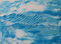
By the way, for this post I am using another one of my landscape experiments where I was trying out various weights of watercolor paper. Quiet Spot was done on 90 lb paper and you can well imagine my horror when it buckled in all kinds of ways. Believe me I learned my lesson about stretching paper. I have held on to this painting because I liked the picture and it is a constant reminder that I have lots of things still to learn!

Quiet Spot, Acrylic on 90lb watercolor paper, 8"x10", Not for sale

Saturday, December 6, 2008

Practice makes.......better?


In response to my last post, Paula Villanova reminded me of the old saw about how you can get to Carnegie Hall. The answer is "Practice, practice, practice!"

Sunny Meadow is illustrative of the "practice" aspect of my self-education. In the early days of my playing around with paint and canvas, I was completely baffled by the seemingly infinite range of greens that are possible in a landscape! After many attempts to "get is right", I ended up with Sunny Meadow. Perhaps on par with the exhilaration of riding a bike without the training wheels, I was struck by how everything seemed to click together for this piece. I am sharing it for the benefit of all those self-taught artists who despair that they will ever attain sufficient command of their materials to make anything of interest. All I can say is you MUST keep trying.


Sunny Meadow, Acrylic on canvas board, 11"x14", Not for sale

Sunday, November 30, 2008

Light and Dark

original landscape painting in acrylic by atul pande
Readers of this blog might think I never do a painting without setting a challenge. Perhaps so. But isn't self-imposed challenge essential to self-guided learning? All of art theory I know comes from reading cheap art books and visiting lots of museums! Thus, the only way of improving technique is for me to take a 'reductionistic' approach (hmm, perhaps something to do with a lifetime of working in the sciences?) and practice each one of the artistic elements that more skilled artists can effortlessly incorporate into their masterpieces.

Light and Dark is one of my earlier attempts at a landscape in which I tried to obtain a sense of distance just by ever so slightly varying the tone while using the fewest colors possible. This painting uses no warm colors at all. Normally the foreground would be brought closer by adding in a touch of a warm color such as a sienna or red.

In fact, Light and Dark has only cool colors -- even the yellow is a yellow-green. Despite these limitations, the darkness of the trees in the foreground does help give them substance and a sense of proximity. The trees in the background are lighter and, though of nearly the same size as those in the front, they seem to recede just enough for a three-dimensional feel.

Light and Dark, Acrylic on canvas board, 5"x7", Not for sale

Tuesday, November 25, 2008

Blazing Sunset

acrylic abstract painting of a sunset by Atul Pande
The third and last in a series of knife paintings, Blazing Sunset was a challenge because of the complexity of colors I wanted to use. The challenge came from my wish to keep the colors as pure as possible and allow some optical mixing to occur on the paper without letting them get muddy. I also wanted to create some sense of movement that is often typical of fiery sunsets as they get to their peak. Keeping the knife strokes in the sky at a diagonal enhanced the feeling of movement such as might happen in a real sunset.

Blazing Sunset, Acrylic on 300lb watercolor paper, 11"x14", $75 (unframed)

Monday, November 24, 2008

Poppyfield

acrylic abstract painting of poppies at high noon by atul pande
Poppyfield at High Noon is another knife painting in the same series as Sunrise. The technique here was similar to that I used for Sunrise with one exception. Most of the painting was done in one session but the highlights in the sky and the red of the poppies were added after the first layer had completely dried. Inevitably, once the thickly applied paint had dried the next layer could only be applied to the bumps and ridges of the previous layer. This shows well in the rather random appearance of the highlights in the sky.

Upon stepping back from this painting I liked the effect -- and left it alone. I guess while the artist attempts to control the medium and technique, the medium can sometimes control the art.

Poppyfield at High Noon, Acrylic on 300lb watercolor paper, 11"x14", $75 (unframed)

Sunday, November 23, 2008

Sunrise in Abstract

abstract acrylic landscape painting of sunrise by Atul PandeKnives are a fun tool for acrylic painting particularly when using the wet-on-wet technique. Paints can be dragged across the canvas to create interesting mixtures that allow for optical blending that might otherwise take hours of work with a brush.

I started Sunrise at the horizon with the lighter color and then worked upward and downward into the darker colors. By using minimal strokes I was able to keep the colors clean yet achieved the highlights in the sky. The trick to brilliant highlights when working wet-on-wet is to gradually make the knife strokes lighter and lighter to avoid moving the darker paint layer underneath. Seems like an obvious thing but took me a while to discover this for myself!

Sunrise, Acrylic on 300lb watercolor paper, 11"x14", $70 (unframed)

Sunday, November 16, 2008

Day's End


Sunsets are always fun to paint because they offer an opportunity to play around with colors to heart's content. When I was into photography some years ago, sunsets were my favorite topic. Waiting and watching to capture the exact moment on film had an educational side to it that I only realized years later when I started painting. The stages of an evolving sunset -- the unpredictable inter-play of light, clouds, wind and atmospheric temperature, and the final moments to the climactic scene -- became so familiar that my very first painting was a sunset. Sadly, it turned out to be a hideous caricature of colorful blobs on canvas. I am not sure I even have it any more!

Marsh Sunset is inspired by various photographs I took of sunsets and marshes when we lived in Connecticut. The paints are applied thinly and it took several glazes to get the colors right where I was satisfied with them.

Marsh Sunset, Acrylic on Canvas Board, 16"x20", $120 (framed)

Friday, November 14, 2008

Humble Inspiration

rural landscape in acrylic by atul pande
Some years ago while I was living in Michigan, every day I would drive by a patch of country road that went through swampland that had been created as a result of housing developments all around. Hardwood trees that had died from waterlogging still stood tall and majestic, now home to woodland birds and other creatures.

A mental sketch of those swampy scenes has hung around in memory and was the source for Dead Woodland. There is nothing special about the technique here, although I was able to use my (only) recently refined skill in the use of the liner brush to create the tree branches.

Dead Woodland, Acrylic on canvas board, 16"x20", $100 (unframed)

Friday, October 31, 2008

Time-limited Painting

original acrylic painting of marshland by atul pande
Putting artificial constraints on the painting conditions can have a simplifying effect on the composition and technique. Three Trees was completed with a limited palette and limited brushstrokes.

For Marshland, I set a time limit of about 20 minutes from picking up the brush to the finished painting. To be honest, I did spend many days rehearsing the painting in my mind. I deliberately chose a colorful palette so as to not to waste time picking the perfect color.

The time limit led to minimal working of the paint. This in turn produced freshness of color that would be easily lost by excessively re-working the paint.

Marshland, acrylic on board, 8" X 10", $75 (unframed)

Saturday, October 25, 2008

Tonking an abstract?

abstract in acrylic by atul pande Light
abstract in acrylic by atul pandeWaves
I read recently about a technique called 'tonking' (named after an art professor, Henry Tonks) which has traditionally been used in oil portraiture to smooth out the underpainting and remove the brushmarks. The basic tonking technique involves laying an absorbent piece of paper (newsprint, paper towel, etc.) over the wet painting, pressing down lightly and lifting up.

I tried a variation of tonking on the two small abstracts, Light and Waves, which I am not sure are entirely finished but I decided to post them anyway. For Light, I applied layers of black and blue thick color with a knife and allowed it to dry. The texture from this first layer allowed the next layer to be spread with uncontrollable variations. While the paint was still wet, I placed a folded sheet of newspaper on top of the canvas, pressed down evenly with my hands and lifted the paper off. Unlike tonking for portraiture, I was aiming to create texture -- and I got it!

For Waves, I squeezed paint (white, light and brilliant blue) directly on to the canvas and spread it with a knife until I got a wavy effect. I then placed a piece of plastic wrap on the wet paint, pressed it with my hands and lifted it off. The texture that appeared looks like tree branches hanging over a seascape.

I may work over these pieces to add some highlights but thought the use of tonking on abstracts might be of interest. Tell me what you think.

Light, Acrylic on canvas board, 5" X 7", Not for sale
Waves, Acrylic on canvas board, 5" X 7", Not for sale

Saturday, October 11, 2008

Repeating themes

rural landscape original painting by atul pande
Sometimes I find that trying out variations of the same theme in different pieces can break the monotony of doing the same painting over and over again until you get it right. Those of you who visit this blog will know that farmland fascinates me and I have often posted paintings inspired by this theme.

Hayfield is a small piece that was done some time ago, but really just finished recently by adding highlights to the foreground. Pieces like this have taught me that aspects of the same scene can be re-arranged in numerous ways to compose a painting. The discipline that comes from doing such a "series" of paintings has helped me overcome the beginner's notion that I must have novel inspiration for each piece!

Hayfield, Acrylic on canvas board, 5" X 7", $35 (unframed)

Thursday, October 9, 2008

Limited palette painting

contemporary rural landscape original painting in acrylic by atul pande
Since I can only paint when I am not busy with my full-time 'day job', several days often go by without my touching a brush. Even when there is a long gap I still keep thinking about composition and technique, working them over in my mind for when I do get to my studio. Upon picking up a brush I often feel driven to quickly complete a piece. Nothing helps this more than having a simple composition and a limited palette.

Three Trees is a small piece done with just four colors (dioxazine purple, light blue permanent, chromium green and yellow ochre, plus white gesso) and one filbert brush. While doing this painting, I roughly counted the brush strokes and I am pretty sure that there were less than 50. Next time I will be aiming for less because it sems to lead to cleaner color.

Three Trees, Acrylic on canvas board, 5" X 7", $40 (unframed)

Saturday, October 4, 2008

Afternoon on the Prairie

rural landscape acrylic art fine painting by atul pande
This is a rather fast knife painting, an approach perfectly suited to acrylic paint. The colors were mixed directly on the board and moved around only as much as needed to the shapes and light-dark contrasts. Even the colors in the tree (ultramarine blue and cadmium yellow medium) were moved just so as to create the shape. The fact that this minimal working of the paint still produced a mostly green hue reinforces the wisdom about how overworked paint can lead to mud!


As I said in another post, scenes such as this one are commonplace in the midwest and their beauty probably wholly unnoticed by most people. To me the play of atmospheric effects on farmland along with the change of vegetation with seasons is enough to inspire forever.


Afternoon on the Prairie, Acrylic on board, 11"X14", $150 (unframed)

Tuesday, September 30, 2008

Rockface


Abstract painting allows a level of freedom that can be hard to deal with if one is coming from another, tighter style. Today’s post illustrates that well for me.

Rockface was done in two sessions. At first the underlying cooler colors (blue, violet, grey and black) were laid down in a rough manner. The idea was just to get the canvas covered. Once this was dry, the warmer (yellow, red, and orange) paints were applied thickly with different sized knives. Lightly grazing the paint-loaded knife across the previous dry layer is a perfect method to reveal unpredictable textures and shapes. While working the second layer two things happened. First, craggy shapes began to appear almost as if on their own. Second, I could feel the temptation to keep working the paint growing with each stroke! As any artist knows, the latter is the surest enemy of beautiful vibrant color. Fortunately, I was able to stop before ending up with a lot of mud on the canvas.

Rockface, Acrylic on canvas board, 18”X24”, $350 (Unframed)

Friday, September 26, 2008

Urban Jungle - Another Abstract Piece

acrylic abstract painting of urban jungle
Some years ago on a visit to the University of Michigan Museum of Art, I was awed by a much publicized exhibit the title of which I no longer remember. The exhibit occupied the entire main hall of the museum and consisted of 5-6 canvases, each about 60”X90”. All were completely blank with not even one brush mark of paint on them! An extensive artist statement went on to describe something about how the canvases represented a bold statement about the emptiness of the human condition, and so forth.

Displays like that probably contribute to the average viewer’s belief that abstract art can be done by anyone. I can recall seeing other examples of works in museums across the US and Europe that leave one puzzled as to why the piece is on display. A simple blob of one color on top of another says little to me either about the inspiration of the artist nor their command of the medium or technique. On the other hand, great abstract art can convey the tremendous inspiration and energy of its creator without requiring any philosophical assumptions by the viewer.

I did Urban Jungle in between some of the other works. Though a small piece, it was hard work with many steps. The paints were layered and lifted with both knife and brush. The textured appearance on the upper right was achieved by swirling and lifting paint rather than by adding thick paint. The composition is based on Bob Rankin’s idea of an uneven edge ratio in an abstract painting as a method to create interest. It seems to work.

Urban Jungle, Acrylic on 140lb watercolor paper, 6”X9”, Not for sale

Tuesday, September 23, 2008

Fast and loose

impressionist rural landscape in acrylic paint
The term 'fast and loose' usually conjures up visions of sloppiness. Not so in impressionist painting where the emphasis on speed was often driven by the artist's desire to capture the moment. The rapid pace and minimal reworking of the paint gave rise to a style that suggests energy and movement that is hard to dissociate from the impressionist style.

Summer Scene was done in just about half an hour against a roughly sketched in composition. The only brushstrokes used in this piece are ones that either put the paint down on the paper or those that instantly led to an impression of movement. I made no attempt to smooth the paint or even out the color. Personally I think the sky is the most interesting aspect of this picture!

Summer Scene, Acrylic on 140lb watercolor paper, 9"X12", $70 (unframed)

Sunday, September 21, 2008

Time-of-day effects in a landscape

brilliantly colored sunset painting done with a knife in impasto style
That landscapes are subject to daily and seasonal changes provides opportunity to explore the same scene many times over. In the case of the impressionists, such exploration often spanned many years of their lives. The simplest approach I believe is to create a middle of the day study (such as Distant Coastline), then switch colors and adjust values for other times of day in subsequent pieces.

Sunset is an attempt to use the same composition as in Distant Coastline but with colors that might be more likely as the color hue and temperature changes with the waning of the day. The basic method used in Sunset is as I have previously described -- layers of gesso worked to a buttery cover for the canvas and then other colors worked into it with a knife.

Pictures like Sunset do not effectively separate the background, middle ground and foreground - except with the use of color. This can make the perspective appear a bit flat. This is less of a problem for an impressionistic work like this one but would be problematic for a more realistic style.

Sunset, Acrylic on canvas board, 8"X10" $90 (unframed)

Monday, September 15, 2008

Quick studies aren't so quick!


Before taking up painting, I had the naive impression that doing a "quick study" meant less effort. As I have tried different techniques to get to a finished picture, it has become evident that a quick study sometimes is anything but. Getting the composition and tonal values right can often be almost as much of a challenge as finishing the final picture or a bigger version of the study. In industrial parlance, a study would be the prototype from which the final (or 'production') version is derived.

The two studies here use the same compositional elements. The paint is applied thinly with a small brush. This allows a choice of finishing the painting either with thin or impasto application of paint. In the meantime, if I don't quite like the study it is but a simple matter to re-coat the canvas with gesso and start all over again.

Countryside 1 and 2, Acrylic on canvas board, 5"X7", Not for sale

Tuesday, September 9, 2008

Abstract flower


This painting is in the same series as Blue Flower. I think close-up paintings of flowers can appear to be a pure abstract of the form, color and tone of the flower. Colorful Mum was triggered by a vase full of brilliant chrysanthemums. Instead of trying to capture the beauty of the full arrangement, I chose to zoom in on part of one flower to fill this canvas.

Colorful Mum, Acrylic on canvas board, 8"X10", Not for sale

Sunday, September 7, 2008

Backlit flower


Flowers are a great source of painting ideas and have inspired some of the most beautiful paintings. I did Blue Flower a while ago when I was also experimenting with close-up photography of flowers. I did some sketches and then settled on a single flower with light coming in from behind which served to highlight the center of the flower and also brought out the variations in the petals.

Blue Flower, Acrylic on canvas board, 18"X24", (Not for sale)

Wednesday, September 3, 2008

Minimal brushstrokes painting style


An exercise I have found quite useful in developing a looser style of painting is to do a painting with the fewest strokes possible. This requires minimal working of paint on the surface leading to a freshness of color that can be easily destroyed in just a few more strokes.

In Reflections, I have used a rather common scene of trees reflected in the water to demonstrate a minimal brushstrokes approach. The palette is restricted (ultramarine blue, sap green, cadmium yellow and titanium white) and I used the biggest brush I could force myself to pick! After all, this is a small canvas and the temptation was to reach for a small brush. The bigger brush allowed for the canvas to be covered quickly and with the self-imposed limit on brushstrokes, there was no choice but to leave the paint alone after it was down on the canvas.

Reflections, Acrylic on canvas board, 5”X7” (Not for sale)

Sunday, August 31, 2008

Fascination with farmland

farmland at dusk
Few scenes could be simpler than the farmland of the North American midwest. Even though I grew up in an urban environment, spending over two decades in Ontario and Michigan allowed me to appreciate the endless possibilities offered by the farm scene for a landscape painter.

Dusk emphasizes that quintessential element of the American farm, the treeline often planted or retained as a windbreak, which can be set off either against the background or the foreground to create interest. The paint is laid on rather thinly in this painting allowing the canvas texture to show through. Dry brushed highlights (to which the camera does not do justice) can be seen in both the sky and the field. These are just enough to suggest a low and distant sun, perhaps even just below the horizon. The overall mood of the painting definitely evokes a sense that the day is done.

Dusk, Acrylic on canvas board, 5"X7" $40 (unframed)

Saturday, August 30, 2008

Seascape in impasto

coastal landscape
Painting with a knife lends itself to the creation of texture that adds to the sense of depth in a painting. The thicker the paint, the richer the texture. The short open time of acrylic paint limits how long the paint can be moved around on the canvas. This requires the artist to work quickly.


For Distant Coastline, I covered the canvas with a thin layer of acrylic gesso and let it dry. Then I used a painting knife to roughly spread thick gobs of white gesso all over the canvas starting from the top. The sky and the water were painted starting from the top and the bottom, respectively, using ultramarine blue closest to the top and bottom. Cerulean blue was used closer to the horizon. With more gesso on the painting knife I spread a thin layer from the top towards the horizon. I repreated the same process from the bottom up. By varying the pressure of the knife, I was able to create the color-mixing and textures that I wanted.

By now there was enough pain on the canvas to slow down the drying giving me enough time to work the coastline. The coastline was built up with layers of dioxazine purple, burnt umber and ivory black. Very thin lines of paint along the knife edge were worked into the creamy layers of gesso. Once the outline of the coast was set, more paint was added to create depth. Finally, with a thin bead of white gesso on the knife, I cleaned out the bottom edge of the coast. This also allowed some of the land colors to be drawn into the water creating reflections.

Distant Coastline, Acrylic on canvas board, 8"X10" $90 (unframed)

Wednesday, August 27, 2008

Simple watercolor

sand dune watercolor Watercolor is probably not the easiest medium for self-taught artists. From figuring out the choice of paper weight to the amount of water to use were aspects of using watercolor paints that I learned through experimentation. Having started with acrylics first, it was easy to assume some of the same attributes would carry over. The task proved much trickier as I came to realize what every half-decent watercolorist knows! Watercolor paint can only be worked over so much before the freshness of the color is lost leading to drab, muddy pictures.

Sand Dunes was one of my early attempts in watercolor and one that reinforced some key learnings: (1) Use the fewest colors possible, (2) exploit the whiteness of the paper to achieve highlights, and (3) be bold with the brushstrokes. The last may be the least obvious but not less important than the other points. Slow, tentative brushstrokes inevitably are the prelude to overworked areas that spoil the painting.


I also like Sand Dunes because it was done with just two colors: yellow ochre and ultramarine blue. Simple palette, simple painting.


Sand Dunes, Watercolor on 140lb paper, 5"X7" (Not for sale)

Sunday, August 24, 2008

Painting for fun!

red flowers

Recently I read a blog post by a professional artist in which she asked the question "Can anyone be an artist?". Without going into detail, I gathered that according to this blogger only some individuals who possess attributes such as aspecial drive to create and originality of expression can be artists. I have no argument with the notion of "specialness" that makes one an artist. The more important question to me (being neither a trained nor professional artist) seems to be "Can only artists create art?". I am sure any of you who read this will have your own views. Personally, I believe art is not the exclusive preserve of "artists". External perspectives, such as those of the audience, have a role in defining what is art. Hence, even the creation of a non-artist could be perceived as art is if the audience says so! This is the sort of external validation that separates, for example, graffiti that is unwanted from that agreed by many to be a form of atistic expression.

Philosophy aside, sometimes painting is just for fun and not a response to some inner angst that must drive creativity. Red Flowers is one such fun painting. It took only a few minutes to do. Perhaps to some it will appear trivial or reminiscent of grade school 'art'. But this little painting makes me smile every time I look at it. Tell me what you think.


Red Flowers, Acrylic on canvas board, 5"X7", (Not for sale)

Thursday, August 21, 2008

What to paint?

sunny fields
Since taking up landscape painting a few years ago, I am always looking for sources of inspiration. My interest in photography many years ago taught me a bit about composition. Of course, painting gives even greater flexibility since it is possible to "re-arrange" objects in the scene unlike in photography. Yet what I find is that often the same scene evokes many different interpretations of light, space, form and perspective.

Sunny Fields reminds me of an American midwest scene, such as you might drive by on the freeway without paying attention. Even the greatest hurry is insufficient sometimes to allow one to ignore certain scenes that have just the right combination of elements -- perhaps even something as trivial as an angled sliver of light hitting the grass or the treetops in a way that makes an ordinary setting memorable. The painter is at liberty to interpret such moments in a way that perhaps a photographer might not.


Sunny Fields, Acrylic on canvas board, 12"X16", $100 (unframed)

Sunday, August 17, 2008

Brushless abstract


As a novice artist, I have been tempted to view the materials as being incredibly important to the artistic output. After much frustration and the inevitable education that comes from "just doing it", I have come to realize that materials have their limits. The most expensive brush, paint or background cannot make up for what the artist must bring to the process.


Summer Flowers was inspired by my use of a clear glass kitchen cutting board as my palette. I keep it on top of a white work table so it serves as a perfect surface to lay out or mix paints. Afterwards, I just let the paint dry then spray it with water and scrape off with a knife. After I have used a number of colors on the glass, sometimes I can see interesting patterns. So for Summer Flowers, I laid out an arrangement of heavy-body acrylic paints (yellow ochre, cadmium yellow medium and sap green) then sprayed generously with water. As the colors began to run together, I took a bunched-up paper towel and dabbed a few clear spots on the palette. I dropped in fluid cadmium red into these spots. Then I took a block of Arches 140lb watercolor paper and put it on top of the palette with just the pressure of my hand. I held it there for about a minute to let the paints grab on to the paper. When the block came off, there were not only interesting patterns but also organic textures suggesting leaves and flowers. For the few places that the paint did not reach, I rolled up a small plastic bag and dabbed in and out of the paint to cover up the glaring white paper.

Summer Flowers, Acrylic on 140lb watercolor paper, 9"X6", $50 (unframed)

Tuesday, August 12, 2008

Color and form in landscape


For the self-taught novice landscape artist like me, the wealth of color and form in a scene can be quite overwhelming. In the beginning, I was strongly tempted to depict every aspect of the picture, paint every leaf on a tree, or accurately note each blade of grass! Now I constantly remind myself to focus on the key elements, simplify the composition and say the fewest possible things in the finished picture. Only by doing so can I hope to fully convey the impact of the scene that inspired the painting. Playing with abstract compositions has helped loosen my style to where I am no longer as scared of the first brushstroke. Now I can abstract the essence of a scene to build the painting.

Michigan Summer, Acrylic on canvas board, 12"X16", $95 (Unframed)

Love of the landscape


Recent interest in the abstract aside, my first attempts with painting in acrylics were landscapes and I continue to be fascinated by them. The possibility to depict the natural environment with a few brushstrokes on a two-dimensional plane is at once challenging and exhilarating. The same vista viewed many times over leads to endless opportunities for a different interpretation. Of course, this is what leads to an unlimited source of inspiration for landscape artists -- witness Monet's prolific output during his years at Giverny.


Water Lillies, Acrylic on canvas board, 5"X7" (Not for sale)

Sunday, August 10, 2008

Second abstract in acrylic

abstract painting in acrylic medium
The ice has been broken! After my first acrylic abstract, I discovered the true freedom that comes from relinquishing control to the medium. Fluid acrylics and a few simple techniques can produce wonders that no amount of slaving over a canvas will. For this piece in particular, I was worried about being able to create enough movement and excitement with just three colors. As it turned out, the acrylics moved in fascinating ways that was a pleasure to watch. I hope you enjoy it too.

Nature's Force, Acrylic on canvas board, 18"X24", $150 (unframed)

First abstract in acrylic

abstract painting in acrylic medium
After a few years of gingerly exploring acrylics in various styles (realistic, impressionistic, you name it), this week I created my first abstract. The beauty of acrylics is you have the chance to start over again when a painting goes real wrong. I was working on a knife painted impasto version of an urban landscape that became muddy and dull. After putting it away for a few weeks, I pulled it out and was impressed by the textures and decided to use the paper for an abstract makeover. Here is the result.


Rising Tide, Acrylic on 300lb watercolor paper, 10"X14", $125.00 (unframed)